A Wilder Experience
Designing an end-to-end brand experience for adventure enthusiasts — a seamless booking platform for long-range traverse expeditions
Role
UX Designer | Branding | Logo Design | Web Development
Industry
Outdoor Adventure
Duration
12 months

Results & Impact (Projected / Measurable Goals)
+20% qualified leads in first 6 months.
<30% drop-off in booking funnel.
+40% time-on-trip-detail pages (engagement).
4.5★+ review average post-launch (trust validation).
Stage 1. Market research and analysis
Initiated the project with comprehensive market research, analyzing competitors and identifying gaps in the social dining app market. Conducted surveys and focus groups with potential users to understand their needs, preferences, and pain points regarding dining out and socializing.
Synthesized research findings to develop a clear value proposition for the app, focusing on unique features such as group dining options, personalized restaurant recommendations, and event planning capabilities.
Overview
A Wilder Experience is an adventure-based tourism platform connecting professional tour operators with experienced travelers seeking multi-day, overnight backcountry traverses.
The challenge was to design a digital experience that inspires confidence, communicates safety and logistics clearly, and streamlines the booking journey for high-commitment trips.
The Challenge
Booking a long-range traverse is unlike purchasing a day tour. Customers face:
High stakes — cost, safety, physical difficulty.
Complex logistics — equipment, training, and scheduling.
Trust barriers — verifying guides, operators, and certifications.
Fragmented information — routes, itineraries, and preparation details scattered across multiple sources.
The website needed to:
Build trust quickly with new visitors.
Educate and qualify travelers at different skill levels.
Simplify a multi-step booking process (dates, equipment, waivers, payments).
Support operators with clear trip listings and logistics communication.
Research & Discovery
Methods
Stakeholder Interviews: operators, guides, business owner.
User Interviews (12 participants): experienced backpackers, time-poor professionals, first-time multi-day trekkers.
Competitive Analysis: studied adventure travel platforms (G Adventures, Intrepid, niche operators).
Analytics Review: identified drop-offs on booking flows (if existing site).
Key Insights
Trust is the tipping point — users won’t book without visible safety credentials, guide bios, and transparent itineraries.
Trip detail pages = conversion drivers — must be structured, visual, and actionable.
Preparation content reduces anxiety — packing lists, training guides, and cancellation clarity build confidence.
Mobile-first is critical — 70% of research and booking happens on mobile.


Personas
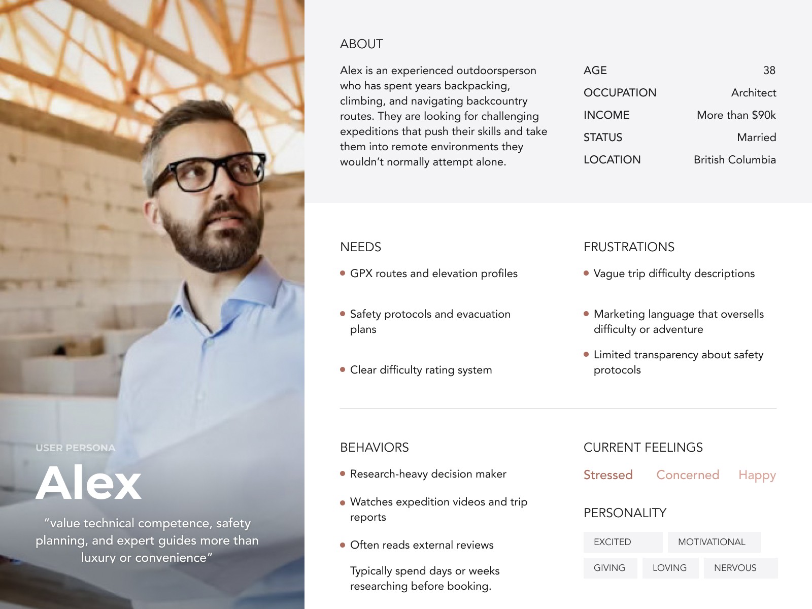
Persona 1 — Alex, The Seasoned Backcountry Leader
Age 30–45, avid hiker, wants remote, technical traverses. Needs: route difficulty, navigation requirements, guide ratio, gear list, evacuation plan. Conversion signal: confident when trip logistics + safety are explicit.
Persona 2 — Maya, The Time-poor Adventure Seeker
Age 28–40, has limited vacation windows, books guided trips to offload logistics. Needs: clear schedule, travel logistics, price breakdown, availability calendar. Conversion signal: clear dates + easy online booking.
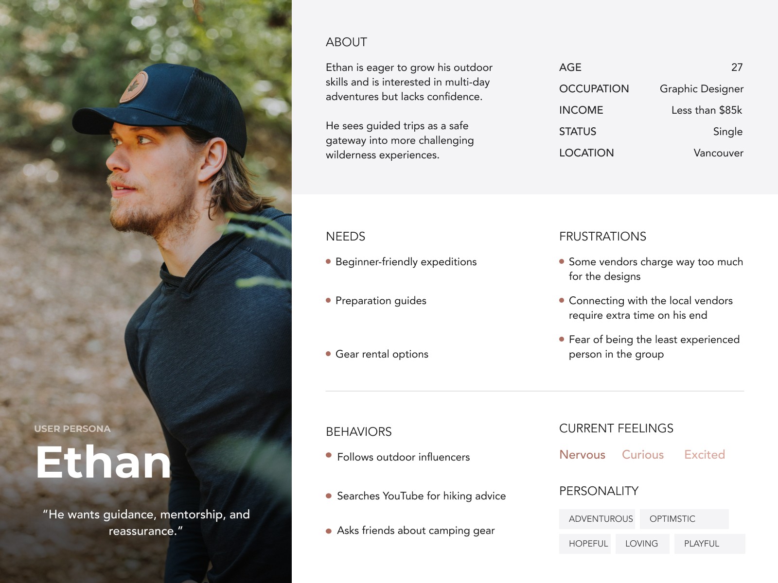
Persona 3 — Ethan, The First-Time Multi-Day Camper
Age 22–35, wants to “level up” skills but is nervous. Needs: beginner-friendly options, training/preparation content, refund/cancellation policy, testimonials. Conversion signal: educational content + small-group, guided offerings.
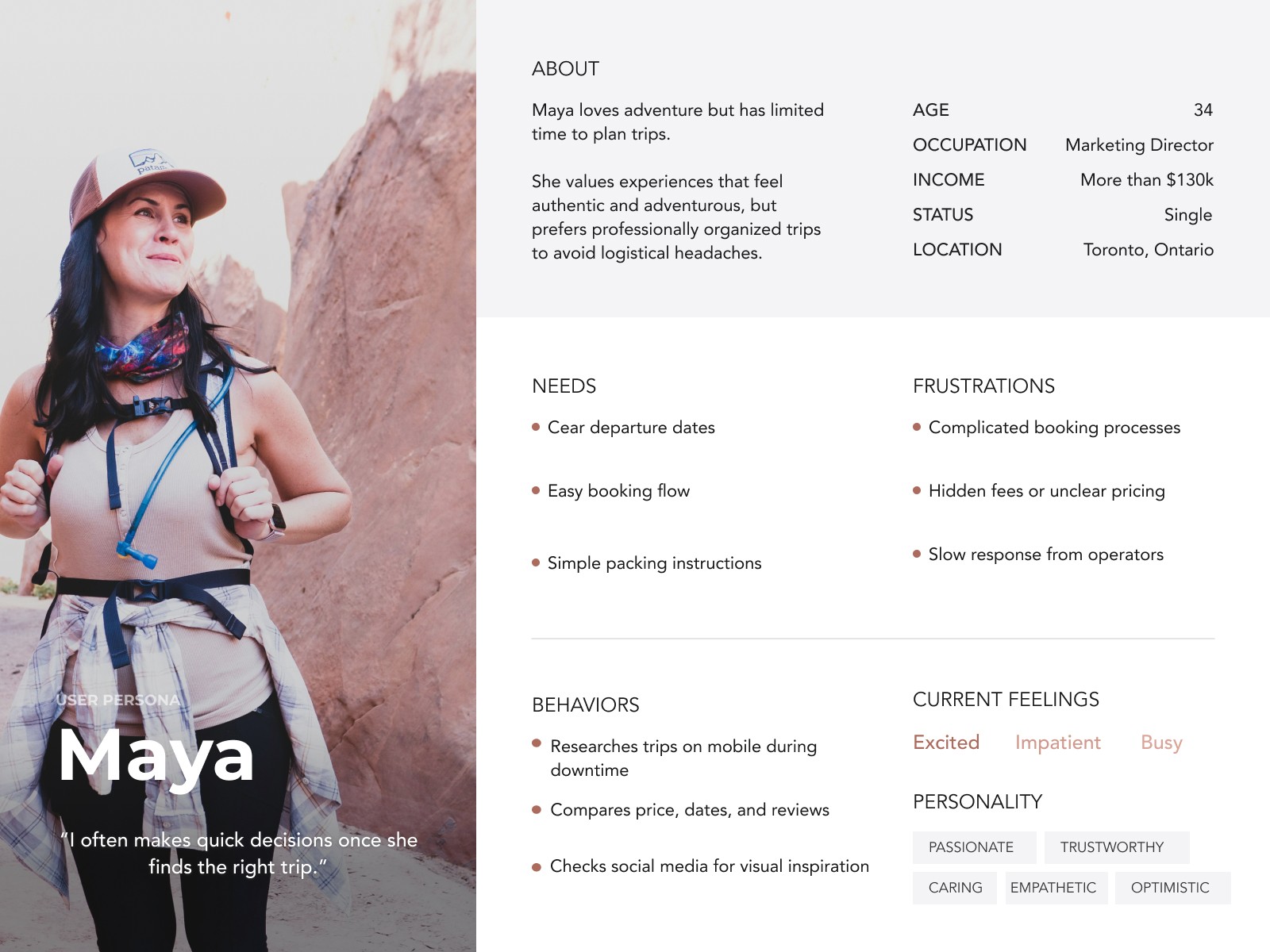
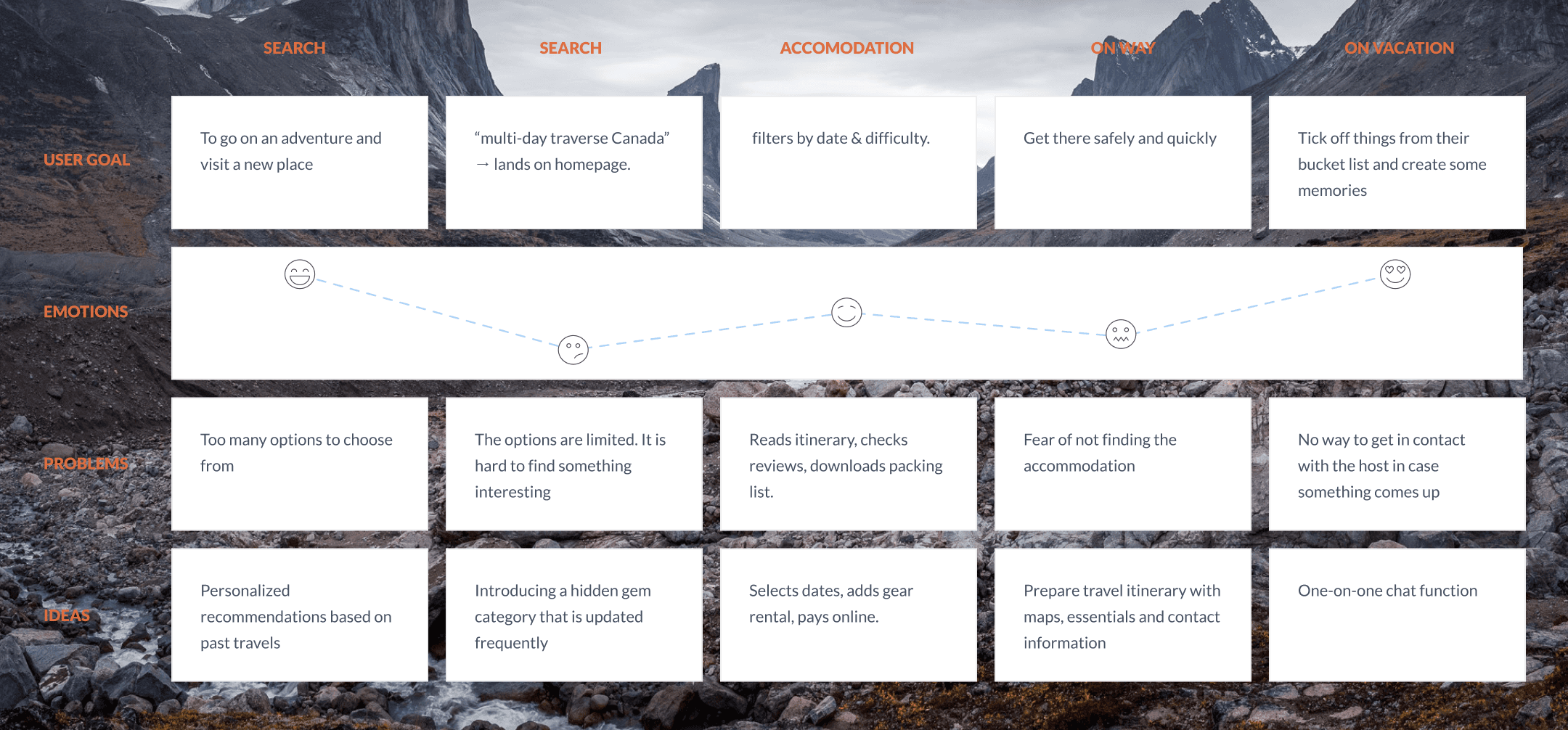
Journey Map Example (Maya — The Adventure Seeker)
Search: “multi-day traverse Canada” → lands on homepage.
Browse Trips: filters by date & difficulty.
Trip Detail: reads itinerary, checks reviews, downloads packing list.
Booking Flow: selects dates, adds gear rental, pays online.
Confirmation: gets personalized trip pack & pre-trip checklist.
Pain points solved: uncertainty → replaced with structured guidance & visible support.
Design Approach
Information Architecture
Top-level nav: Home • Trips • How It Works • Safety & Prep • Operators • Blog • Contact
Key Pages
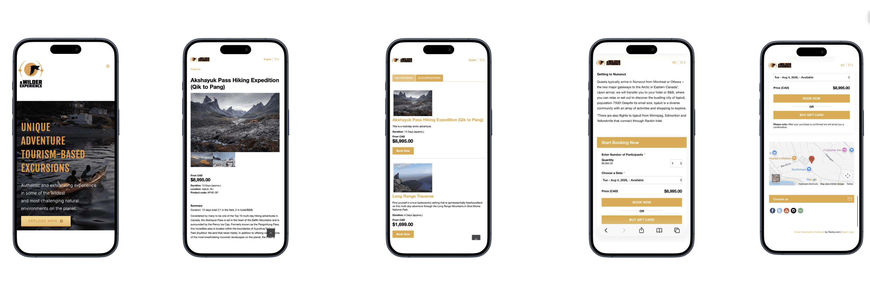
Homepage: immersive visuals + primary booking search + trust signals.
Trip Listing: filters by duration, difficulty, terrain, dates, price.
Trip Detail: hero gallery, route map, itinerary by day, gear list, safety & evacuation info, guide profiles, reviews, sticky “Book Now.”
Booking Flow: calendar → traveler info → add-ons (gear, transport) → waivers → payment.
Prep Hub: packing lists, training guides, FAQs.
Operator Profiles: certifications, photos, bios.
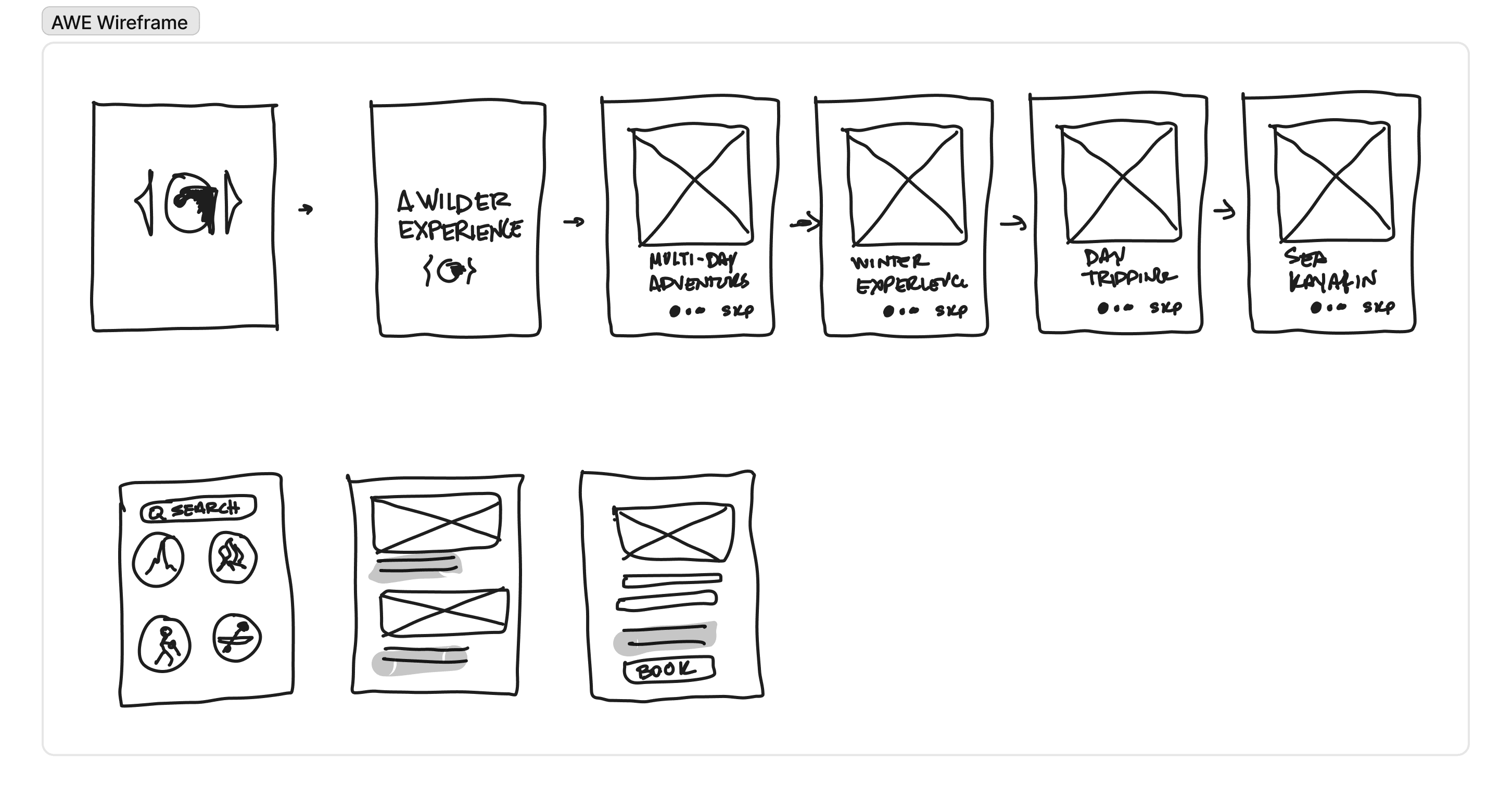
Wireframes & Prototypes
Mobile-first wireframes for homepage, trip listing, trip detail, booking flow.
Interaction Highlights:
Sticky booking CTA.
Collapsible safety + logistics sections.
Integrated maps & GPX downloads.
“Skill Match” quiz to recommend suitable trips.
Visual & Content Direction
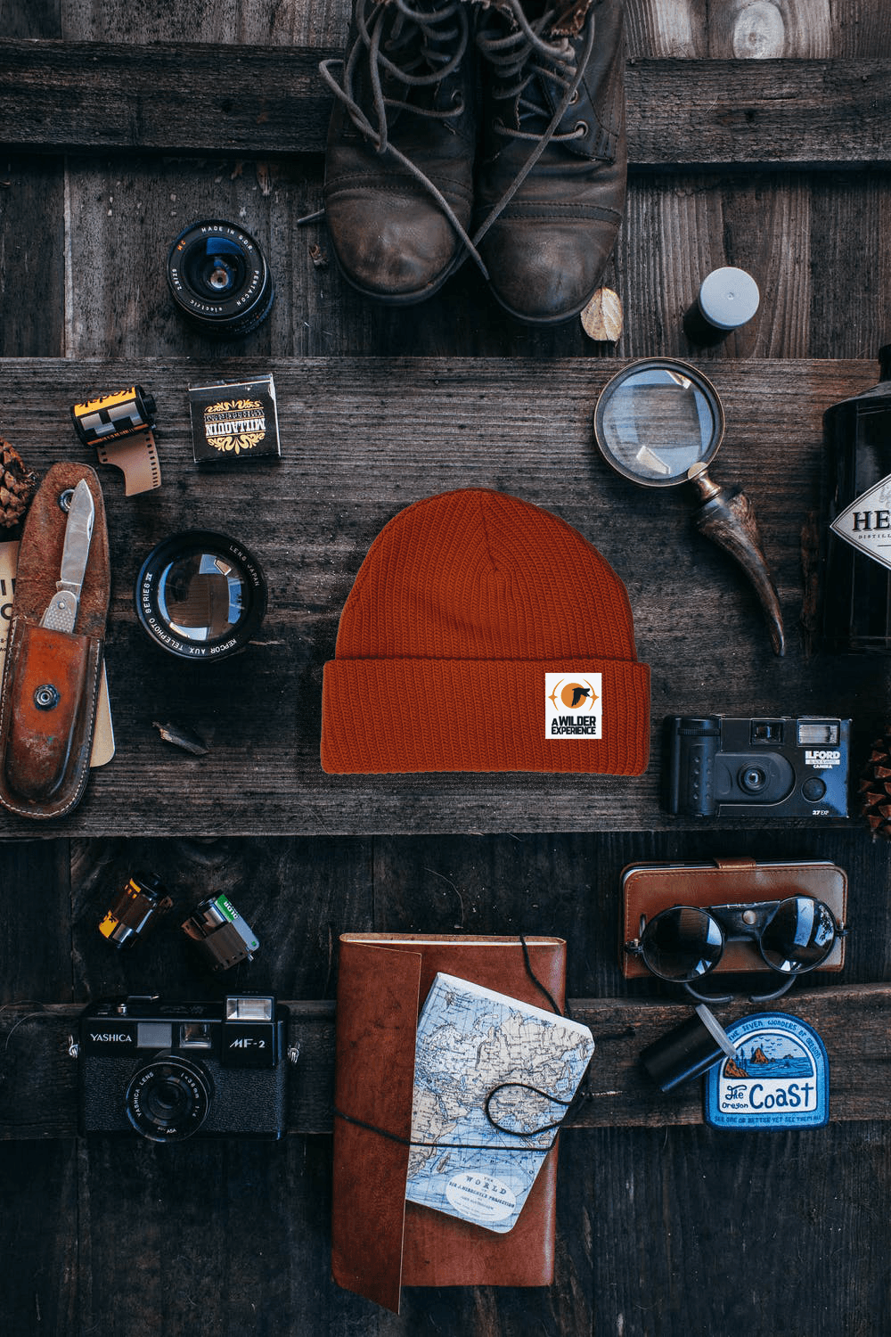
Tone: Rugged yet reassuring — expert-led adventure.
Palette: Deep forest green, slate gray, and ochre accents.
Photography: Authentic backcountry imagery (small groups, camp life, terrain).
Microcopy: Clear, safety-first, action-oriented (“Check Your Gear,” “Confirm Your Spot”).Stage 5. Research plan
Accessibility & Performance
WCAG AA compliance (color contrast, semantic HTML, keyboard nav).
Optimized large imagery with lazy loading & CDN.
Mobile-friendly booking flow with digital wallets.


Deliverables Produced
Personas & journey maps.
Information architecture & sitemap.
Wireframes & prototypes (mobile + desktop).
UI design system (colors, typography, components).
Booking flow prototype.
SEO & content strategy plan.
Measurement framework (analytics + A/B test roadmap).
Other projects

Chicago Knife Center
A digital experience built for professional chefs, Michelin-star restaurants, commercial knife rental clients, and walk-ins — focused on speed, trust, and precision.

Dallas Flash Pickleball
Designed Dallas Flash Pickleball’s first digital experience to rally fans, players, and families. The goal? Build hype, sell merch, and create a flashpoint for community engagement.

North Shore Language Atelier
Revolutionizing the educational ecosystem with a web development to enhance interactive learning collaboration.

Morning Drop Off Club
To turn the everyday school drop-off into a doorway for human connection — building communities one hello at a time, and raising kids who see what real citizenship looks like.

amigo
A friendship-rooted brand designed to empower creators through collaboration, storytelling, and commerce. This project transformed an emotional concept into a scalable brand and digital ecosystem.